In this Gallery we will feature work done by both the Art and Graphic design students at NAHA. Enjoy!
2012-2013
Art Introduction to Line
Pattern
-Julie N.
Wire Sculptures
I used line in many different ways. First, I used it to create patterns. The different orientations of the lines help to draw in the viewer’s eyes. The lack of lines, specifically in the cat, help to create a focal point among the varying composition. I also used line to create depth and shadows to make the images look more 3D and realistic. When the lines were closer together, they appeared darker and helped make the objects look like they were coming off the paper. Lastly, I used the different widths of the lines to my advantage. If I wanted something to stand out more, I usually tended to use a thicker pen, which left a heavier line. If something was of more background or was more detailed, I opted to use a smaller tipped pen to make each line more precise and accurate.
-Julie N.
Wire Sculptures
photographs taken by student to emphasize line in shadow:
-Skylar F.
In my wire project I used line by creating shapes that looked like the
picture of the moose. I used organic shapes to make the shape of the moose.
I used balance by balancing out the antlers on each side, by making
them the same size. I also used movement by flowing the wire into one portrait
of a moose.
photographs taken by student to emphasize line in shadow:
I used wire (line) to emphasize the texture of the bark on a tree.
The wire goes up and down the trunk many times, thus showing the rugged
pattern and texture of the wood. The leaves were created unproportionally
to attract the attention of the audience, because in real life the leaves
are the part of the tree that stand out the most, especially during fall.
The branched are all over the place and different to show that
trees are all unique, much like people.
-Sidonie C.
photographs taken by student to emphasize line in shadow:
In my wire sculpture
I used a lot of line when it came to designing
the boat and anchor.
From straight lines to curved lines and
everything in-between. For shape
I tried to balance out the sizes of both
the boat and anchor to make it
look more realistic. Also, the value and
shade really reflects well on
the shiny silver metal, especially when the
sunlight comes into the
room. There is no color in this project,
nor texture. However I did use
shape to form the sculpture.
-Hannah E.
Art Value and Shading
-Sidonie C.
-Delaney D.
-Hannah E.
-Skylar F.
-Delaney D.
Art Color
-Bella B.
-Delaney D.
Art Perspective
-Delaney D.
-Julie N.
-Bella B.
Painting Black and White
-Megan H.
2011-2012
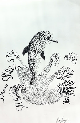
Graphic Design Typography Drawing
Bridget B.
Paige S.
Art Patterning
Heidi A.
Ashlynne R.
Taylor B.
Hannah K.
Lauren K.
Michaela G.
Hannah E.
Emily E.
Julie N.
Erica D.
Art side project: landscape painting
Taylor B.
Hannah E.
Emily E.
Erica D.
Art Inspired by Georgia O'Keeffe
Art Self Portrait
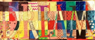
Art "Believe" collaborative project
Graphic Design Design a New Line
Graphic Design Tournament Poster
Art side project: landscape painting
Art Still Life
Michaela G.
Hannah K.
Heidi A.
Lauren K.
Ashlynne R.
Emily E.
Erica D.
Art side project: crow
Ashlynne R.
Heidi A.
Emily E.
more to come...
Graphic Design iExpress
Paige S.
Bridget B.
Art Inspired by Georgia O'Keeffe
Taylor B.
Ashlynne R.
Heidi A.
Lauren K.
Erica D.
Michaela G.
Shannon Y.
Emily E.
Hannah E.
Art Self Portrait
Julie N.
Art "Believe" collaborative project
Graphic Design Design a New Line
Bridget B.
Paige S.
Graphic Design Tournament Poster
Paige S.
Bridget B.
Graphic Design Photographic Collage
Art Pointillism
Art Mixed Media
Julie N.
Bridget B.
Art Franz Marc animal painting
(many of the animals were taken home during the Holidays, but luckily a few stayed here at NAHA)
Graphic Design Juxtaposed Images
Paige S.
Art Franz Marc animal painting
(many of the animals were taken home during the Holidays, but luckily a few stayed here at NAHA)
Graphic Design Photographic Collage
Art Pointillism
Michaela G.
Lauren K.


