
2012-2013:
Introduction to line
gesture drawing-This quick drawing captures the energy and movement of the subject. It does not necessarily have to be realistic. Gesture drawings are often very expressive and allow one the freedom to loosen up and not worry about small details.
pattern- Space and depth can be created through placement and variety of patterning. Matisse frames his female subjects with patterns to emphasize them. Van Gogh creates depth in his drawings through use of multi-directional patterning.
boundary areas- A drawn line divides space on the page to create positive and negative space.
Introduction to Line:
Artists to reference:
http://intheartistsstudionaha.blogspot.com/p/inspirational-artists.html
Warm up: Discuss the importance of line and artists who have used various techniques to achieve a successful work of art through the use of line. Sketch: contour drawing, variable contour drawing, cross contour drawing & blind contour drawing.
Introduction to line
Our world is created by line.
gesture drawing-This quick drawing captures the energy and movement of the subject. It does not necessarily have to be realistic. Gesture drawings are often very expressive and allow one the freedom to loosen up and not worry about small details.
contour drawing- Outline of the object and interior parts of the object, really just the basics showing the object without any shading.
*contour drawing in sculpture
*contour drawing in sculpture
variable contour drawing/value- Vary the width of the contour line to give emphasis and weight to the line. It gives the illusion of the line having more.
cross contour drawing-
Cross contour lines are parallel lines that curve over an object’s
surface in a vertical or horizontal manner (or both) and reveal the
item’s surface characteristics.
blind contour drawing- Blind contour drawings are those created by looking only at the subject, and not the paper while drawing.
pattern- Space and depth can be created through placement and variety of patterning. Matisse frames his female subjects with patterns to emphasize them. Van Gogh creates depth in his drawings through use of multi-directional patterning.
boundary areas- A drawn line divides space on the page to create positive and negative space.
Introduction to Line:
Artists to reference:
http://intheartistsstudionaha.blogspot.com/p/inspirational-artists.html
Warm up: Discuss the importance of line and artists who have used various techniques to achieve a successful work of art through the use of line. Sketch: contour drawing, variable contour drawing, cross contour drawing & blind contour drawing.
Medium:pencil, pen, marker, charcoal, wire, yarn, etc. (your choice)
Project: Create a work of art that effectively uses line. Be able to discuss the way you've effectively used line with the medium you've chosen in your composition.
Value and Shading
http://roberthodgin.com/stippling/
Materials: charcoal, drawing paper, kneaded eraser/ charcoal, white pastel, pastel paper/ graphite, blending stump, kneaded eraser, drawing paper, pen

Hue: Pure color pigment, no addition of white, grey or black. Hue is also defined by the mixture of two pure colors.
Value: The lightness or darkness of a color.
Tint: The mixing result of any color with white, resulting in a lighter color.
Tone:The mixing result of any color with grey.
Shade: The mixing result of any color with black, resulting in a darker color.
http://www.csupomona.edu/~elearning/assets/learningobjects/colortheorysimulation/
-Peguin Cafe Orchestra " Perpetuum Mobile"
Project:Create a work of art that effectively uses color.

- Research/ practice with the technique and medium you've chosen (ex: if you've chosen wire, research wire sculptures and contour drawings for inspiration.Once researched, experiment with the wire until you feel comfortable working with it)
- Research the subject matter you'd like to depict (ex: if you've been inspired by a cow, print a picture out of a cow to work from)
- Sketch a plan (ex:if working with wire, create a small sketch of the cow using contour drawing that you can follow to create your sculpture)
- Start your masterpiece!
Value and Shading
Warm up:Discuss value and shading.
- sketch: use charcoal to create value in a still life drawing
- draw 1 object 3 times (1 charcoal, 1 stippling, 1 cross hatching)
- extra: 6 boxes/smooth steps between boxes for shading
example of charcoal value drawing-

examples of crosshatching-

Illustrations from the book "The Invention of Hugo Calbret" by Brian Selznick:

examples of stippling:


examples of crosshatching-
Illustrations from the book "The Invention of Hugo Calbret" by Brian Selznick:

examples of stippling:


http://roberthodgin.com/stippling/
Materials: charcoal, drawing paper, kneaded eraser/ charcoal, white pastel, pastel paper/ graphite, blending stump, kneaded eraser, drawing paper, pen
Project: Create a drawing using value to depict an image (from life or photograph)
- Shading/Value-Include a large range of values (from the white of the paper to the darkest value possible to achieve)
- Space- Depict the illusion of space through use of shading and overlapping of objects
- Form- Use shading techniques build up value while also utilizing highlights to enhance and create the illusion of form.
Introduction to Color
Hue: Pure color pigment, no addition of white, grey or black. Hue is also defined by the mixture of two pure colors.
Value: The lightness or darkness of a color.
Tint: The mixing result of any color with white, resulting in a lighter color.
Tone:The mixing result of any color with grey.
Shade: The mixing result of any color with black, resulting in a darker color.
http://www.csupomona.edu/~elearning/assets/learningobjects/colortheorysimulation/
Warm up:
Discuss different color wheel concepts and color relationship terms:
Primary/ Secondary/ Tertiary/ Value Changes (tint, tone and shade)/
Color Neutrals/ Color Relationships (complimentary/
triad/ split complimentary/ analogous/ monochromatic/ warm colors/ cool
colors).
Discuss emotional connotations associated with each color.

http://www.mariaclaudiacortes.com/colors/Colors.html
Discuss emotional connotations associated with each color.
http://www.mariaclaudiacortes.com/colors/Colors.html
- create color wheel by mixing own colors
- sketch: use watercolors to paint to music
-Peguin Cafe Orchestra " Perpetuum Mobile"
Medium: watercolor (use salt, a straw, wet into wet, dry), acrylic, oil pastel, colored pencil, colored markers

-Juli N.
(In each block use a different medium)
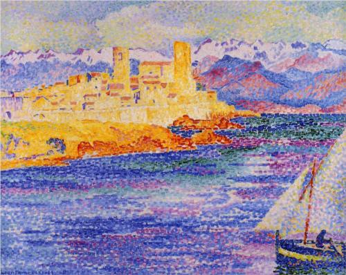
-Henri Edmond Cross
Pointillism is a style of art that uses many dots to create optical blending when viewed from a distance.Think about mixing color by placing colors next to one another, instead of actually mixing.

-Dan Gottsegen
-

-Holton Rower

-Woody Sheperd

- Carl Warner

-Kymm Swam
http://kymmswank.com/main.html
*Also look at paintings under "inspiration"
class 2011-2012:
Introduction to line
charcoal/sketch pen
gesture drawing-This quick drawing captures the energy and movement of the subject. It does not necessarily have to be realistic. Gesture drawings are often very expressive and allow one the freedom to loosen up and not worry about small details.
contour drawing- Outline of the object and interior parts of the object, really just the basics showing the object without any shading.
variable contour drawing/value- Vary the width of the contour line to give emphasis and weight to the line. It gives the illusion of the line having more.
cross contour drawing- Cross contour lines are parallel lines that curve over an object’s surface in a vertical or horizontal manner (or both) and reveal the item’s surface characteristics.
blind contour drawing- Blind contour drawings are those created by looking only at the subject, and not the paper while drawing.
pattern- Space and depth can be created through placement and variety of patterning. Matisse frames his female subjects with patterns to emphasize them. Van Gogh creates depth in his drawings through use of multi-directional patterning.
boundary areas- A drawn line divides space on the page to create positive and negative space.
*examples can be found under inspirational artists
Introduction to Line:
"Patterning"
"Patterning"
Warm up: gesture drawing, contour drawing, variable contour drawing, cross contour drawing & blind contour drawing
Medium: charcoal, sketch pen
Project: Create a drawing that depicts space through patterning
- Line Value- When objects appear to be closer to the viewer, lines become larger/thicker. In contrast, when objects appear to be further away, lines become thinner/smaller.
- Shading/Value- Instead of using crosshatching or any type of shading, the tighter the patterning the darker it appears, in contrast the more space between the pattern the lighter it will appear.
- Variety- Think about patterns that use organic shapes and patterns that use geometric shapes. What type of pattern should depict a certain subject? For example: You may want to use an organic pattern if you are drawing something in nature, like a tree. If you are depicting something man made you could use a more geometric pattern.
Project Examples:
- Contour drawing that is surrounded by pattern (Artist- Matisse)
- Purely patterning to create shapes, space and depth (Artist-Eli Helman)
Elements and Principle Terms to think about:
Line, Shape, Space, Movement, Variety, Rhythm
Value and Shading
Value/Shading:
"Still Life"
Warm up: 6 block Value Scale-1 crosshatching, 1 stippling, 1 shading
- Box 1 should have no pigment
- Box 6 should be the darkest that technique can go
- Smooth steps between boxes for shading (no giant leaps, and you can tell there's a difference in value)
Materials: charcoal, drawing paper, kneaded eraser/ charcoal, white pastel, pastel paper/ graphite, blending stump, kneaded eraser, drawing paper
Project: Create a drawing of a still life that looks three-dimensional through use of light and shading.
- Shading/Value-Include a large range of values (from the white of the paper to the darkest value possible to achieve)
- Space- Depict the illusion of space through use of shading and overlapping of objects
- Form- Use shading techniques build up value while also utilizing highlights to enhance and create the illusion of form.
Elements and Principle Terms to think about:
Shading/Value, Space, Form
Value/Shading
“Hidden Picture Drawing”
Warm Up: Brainstorm images that may be combined and will work for the assignment. Draw the images lightly together on Bristol.
Stippling is a pen and ink drawing technique that uses small dots to build up the value needed to create the illusion of form. After you have lightly drawn your image, then slowly add value through the application of stippling with pen and ink.
Materials: bristol paper, graphite, pen and ink
Project: Create a pen and ink drawing that uses the technique of stippling, to depict two images can be seen by the viewer.
- Shading/Value- Include a range of values, from the white of the paper to the darkest value possible to achieve.
- Form- Use stippling to build up value and create the illusion of form.
- Harmony- Combine images in a creative manner that allow the forms to become seamlessly united.
Elements and Principles Terms to think about:
Shading/Value, Form, Harmony
example:
Introduction to Color
Warm up: Discuss different color wheel concepts and color relationship terms: Primary/ Secondary/ Tertiary/ Value Changes (tint, tone and shade)/ Chroma Changes/ Color Neutrals/ Color Relationships (complimentary/ triad/ split complimentary/ analogous/ monochromatic/ warm colors/ cool colors)
Medium: watercolor (use salt, a straw, wet into wet, dry), acrylic, oil pastel, colored pencil, colored markers
Project: Collaborate with different artists to create a word of many colors. Color relations will be exhibited in each artist’s group of boxes as well as a variety of mediums.
- Choose a word
- Use a grid to enlarge the image
- Each artist choose 5 squares (squares you choose should not touch)
- Square 1: monochromatic (acrylic would be best to use)
- Square 2: complimentary colors (use any medium)
- Square 3: split complimentary (use any medium)
- Square 4: triad (use any medium)
- Square 5: analogous (use any medium)
- Place squares back in original location to create the image

Introduction to Color
“Drawing Inspired by Georgia O’Keeffe”
“Drawing Inspired by Georgia O’Keeffe”
Warm up: look at the work of Georgia O’Keeffe and discuss the elements and ideas behind her work.
Medium: chalk pastel
Project: Create a drawing inspired by Georgia O’Keeffe by looking at a group of flowers.
· Use a viewfinder to find a composition that encompasses one flower
· Crop the flower to fill the entire page
· Look at the organic shapes of the flower
· Layer pastels to create depth within your colors
Elements and Principle Terms to think about:
Color, Line, Shape, Balance, Emphasis

Introduction to Color
“Animal Painting Inspired by Franz Marc”
Warm up: look at the work of Franz Marc and discuss the elements and ideas behind his work. Sketch an animal and composition for your painting.
"Franz Marc was an Expressionist painter who formed Der Blaue Reiter group with Wassily Kandinsky. They were part of an artistic movement who were searching for spiritual truth through their art. Marc believed that color had a vocabulary of emotional keys that we instinctively understand, much in the same way that we understand music. This language of color was one tool that Marc used to raise his art to a higher 'spiritual' plane, another was his choice of subject."
-Art Factory:
Medium: Acrylic, Canvas
Project: Create a painting depicting an animal in the style of Franz Marc utilizing color to create emotion.
Elements and Principle Terms to think about:
Color, Form, Space, Shape, Movement, Emphasis, Proportion, Harmony

Introduction to Color
“Pointillism and optical mixing"
Warm up: look at the work of artists that use pointillism and discuss the elements and ideas behind this technique.
This technique arose from the French neo-impressionist art movement of the 1880s, in part as a response to scientific discoveries on the topic of color theory. While scientists and artists had long understood the notion of primary and secondary colors, American physicist Ogden Rood added a new perspective on color with his work Modern Chromatics, with Applications to Art and Industry published in 1879. Rood suggested that small patches of various colors, when viewed from a distance, would create the illusion of blended shades and hues. In addition to Rood's work, French chemist Michel Eugene Chevreul also contributed to the neo-impressionist understanding of color, science and art. Chevreul discovered that in tapestries yarn dyes of neighboring strands of yarn contribute to the color which is perceived by the viewer. From this he was able to extrapolate an enhanced version of the existing color wheel. This application of how the eye interprets color greatly influenced the key artists in pointillism.
Written by: Lynn-nore Chittom • Edited by: Elizabeth Stannard Gromisch
Published Oct 16, 2010

Hippolyte Petitjean
Henri-Edmond Cross
Georges Seurat
Theo van Rysselberghe
Georges Lemmen
This technique arose from the French neo-impressionist art movement of the 1880s, in part as a response to scientific discoveries on the topic of color theory. While scientists and artists had long understood the notion of primary and secondary colors, American physicist Ogden Rood added a new perspective on color with his work Modern Chromatics, with Applications to Art and Industry published in 1879. Rood suggested that small patches of various colors, when viewed from a distance, would create the illusion of blended shades and hues. In addition to Rood's work, French chemist Michel Eugene Chevreul also contributed to the neo-impressionist understanding of color, science and art. Chevreul discovered that in tapestries yarn dyes of neighboring strands of yarn contribute to the color which is perceived by the viewer. From this he was able to extrapolate an enhanced version of the existing color wheel. This application of how the eye interprets color greatly influenced the key artists in pointillism.
Written by: Lynn-nore Chittom • Edited by: Elizabeth Stannard Gromisch
Published Oct 16, 2010
Hippolyte Petitjean
Henri-Edmond Cross
Georges Seurat
Theo van Rysselberghe
Georges Lemmen
Giuseppe Pellizza da Volpedo
Pointillism is a style of art that uses many dots to create optical blending when viewed from a distance.Think about mixing color by placing colors next to one another, instead of actually mixing. When you step away from the work does it appear to be a different color?
Pointillism is a style of art that uses many dots to create optical blending when viewed from a distance.Think about mixing color by placing colors next to one another, instead of actually mixing. When you step away from the work does it appear to be a different color?
Medium: colored marker, colored pencil
Project: Create a drawing that uses pointillism.
Elements and Principle Terms to think about:
Color, Space, Movement, Emphasis, Harmony
Introduction to Color/ Perspective
"View the world through different perspectives, a Collage"
Warm up: look at the collage artists such as Mariella Bisson, Dan Gottsegen, Henri Matisse, Pablo Picasso, Georges Braque, Max Ernst, Hannah Hoch and Romare Bearden.
Mariella Bisson:http://www.mariellabisson.com/index.html#lowerhome
Video:
Dan Gottsegen:http://www.vermontel.net/~dgotts/Images%20Pages/newtapestrypaintings.html
Mariella Bisson:http://www.mariellabisson.com/index.html#lowerhome
Video:
Dan Gottsegen:http://www.vermontel.net/~dgotts/Images%20Pages/newtapestrypaintings.html
Dan Gottsegen
Red Rocks
37 x 84", Oil on canvas, 2008
Medium: Mixed Media
Project: Create a collage or a painting inspired by a collage to view the world in a new way through different perspectives.
Elements and Principle Terms to think about:
Color, Form, Space, Shape, Emphasis, Harmony
Introduction to Perspective (1 vanishing point & 2 vanishing points)
2 point perspective example:


Project: Create a drawing or painting that incorporates either one vanishing point or two vanishing points. Think about the perspective of the viewer, is it a bird's eye view or a view from the ground? Think about the season you want illustrate (tooth brush technique to create a snowy scene). Create a space that we can enter into as the viewer.
Examples:1 vanishing point outdoor environments, 1 vanishing point interiors, 2 vanishing points cityscape, 1 vanishing point bird's eye view of city.
Introduction to Portraits

http://www.pixel77.com/drawing-vector-portraits-part-1-the-facial-structure/
http://www.artyfactory.com/portraits/drawing_techniques/proportions_of_a_head_1.htm
Project: Create a self portrait that utilizes correct facial proportions by looking in a mirror.
*inspiration for your self portrait can be found under inspirational artists
Introduction to Perspective (1 vanishing point & 2 vanishing points)
Warm up: become familiar with1 vanishing point and 2 vanishing points.


One Point Perspective
One point perspective is a system of spatial illusion (in our case, drawn on paper) where parallel lines converge, or meet at one point somewhere in the distance. This point is called the vanishing point.

1 point perspective examples:


Two Point Perspective
In two point perspective the sides of the object vanish to one of two vanishing points on the horizon. Vertical lines in the object have no perspective applied to them.

The illustration to the left demonstrates the how to draw a box in two point perspective.
1.) Put two vanishing points at opposite ends of the horizontal line.
2.) Draw in the front vertical of the box. Drawing the line below the horizontal will create a view which we are looking down on. To look at the object from below, draw the front vertical above the horizontal.
3.) Draw lines from the top of the vertical which disappear back to both of the vanishing points. Repeat the process for the bottom of the line.
4.) To complete both of the sides by drawing in the back verticals.
5.) To draw the top of the box, draw lines from the back verticals to the opposite vanishing points.
By altering the proximity of the vanishing points to the object, you can make the object look big or small.

2 point perspective example:


Materials:pencil, pen and/or watercolor
Project: Create a drawing or painting that incorporates either one vanishing point or two vanishing points. Think about the perspective of the viewer, is it a bird's eye view or a view from the ground? Think about the season you want illustrate (tooth brush technique to create a snowy scene). Create a space that we can enter into as the viewer.
Examples:1 vanishing point outdoor environments, 1 vanishing point interiors, 2 vanishing points cityscape, 1 vanishing point bird's eye view of city.
Elements and Principle Terms to think about:
Form, Space, Shape, EmphasisIntroduction to Portraits
Warm up:facial proportions and shading

http://www.pixel77.com/drawing-vector-portraits-part-1-the-facial-structure/
another website that may be helpful with facial proportions:
Materials:charcoal or graphite, mirror
*inspiration for your self portrait can be found under inspirational artists